Story:
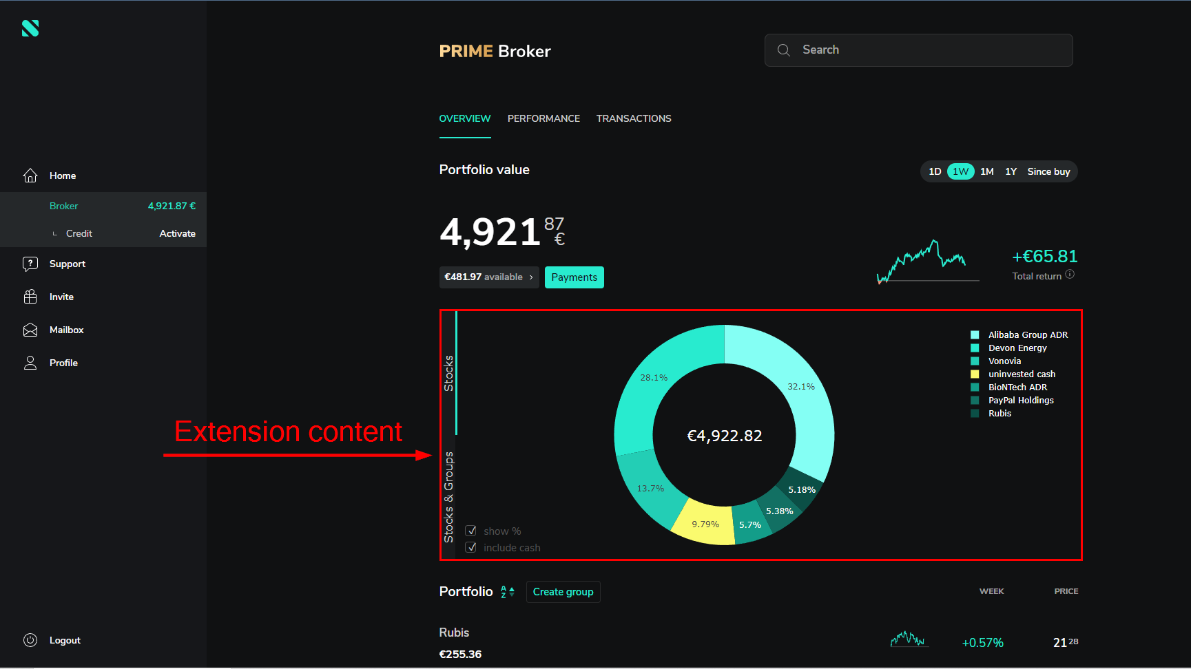
I conducted an experiment with one of my good friends (Hello, Christian), who works as a software developer. After creating this extension and ensuring that it worked correctly, I called him and shared my screen, displaying the website where the content of this extension had already been inserted. Without revealing which part of the website was original and which was my content, I asked him, 'Can you please tell me which part of the website is the content inserted by my extension?' What happened next was quite amusing. He responded, saying, 'The chart is definitely not yours because it's a must-have for investment-related websites where users need to visualize their portfolio's status graphically'. Well, he definitely has a valid point, and his perspective is sound. However, as you already know, the Pie Chart was created by my extension.
Why did I decide to write about this experiment here? Well, when I initially started creating this application, I questioned whether there was a purpose for this extension. This experiment serves as a compelling answer to my own question.
In the realm of 'neo-brokers,' a graphical view is not just a want but a necessity. It's essential not only for clients but also for video bloggers. Many advertisements are now integrated into videos by YouTubers. As someone deeply interested in investments and actively learning about it for a year, I've watched countless YouTubers showcasing their portfolios, and almost every one of them uses graphical charts to display their portfolio's status. I can't recall a single one who didn't employ a graphical chart.
In my opinion YouTubers and other bloggers are among the most significant avenues for advertising the investment platforms like neo-brokers, as opposed to traditional methods. So, the moral of the story is that a graphical view of a portfolio's status is an absolute must-have.
P.S.
After I invested all my savings namely 345,98 €, with the assistance of my extension,
I gained a better graphical perspective on the state of my portfolio.
